Schemata Architects designs tiny Nakamata sweet shop in Maebashi
Tokyo studio Schemata Architects has designed a confectionery store in Maebashi, Japan, with a courtyard to help open up and revive a shopping street that was on the decline.
The Nakamata sweet shop is located on a once-busy street that was at risk of becoming a so-called "shutter street" – a street in Japan where most of the stores have been closed up.
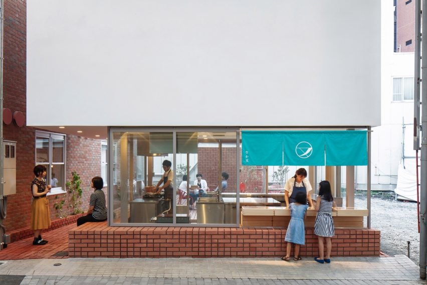
To combat the decline of the street, the Maebashi Machinaka Agency was founded in 2016 as a corporation to promote the area and a number of new projects were launched, including the Nakamata store and its neighbouring shops.
An existing two-storey building was demolished to create the sweet store, which has a brick base that extends into an open yard for eating and socialising.
"The bricks are the chosen material as a symbol of reproduction of Maebashi city," Schemata Architects founder Jo Nagasaka told Dezeen.
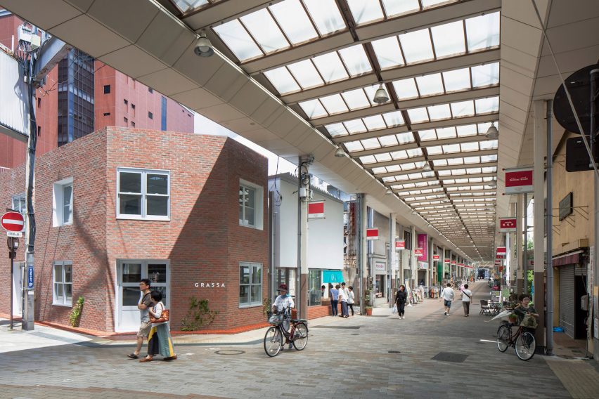
The use of brick was also a requirement for the project since it was part of the Maebasha Machinaka Agency's design code, which informed the design.
"The interesting part of this project was that we were able to design while checking the progress of the projects on both sides," the studio said.
"We imagined how they would stack bricks on both sides and studied how to stack our bricks in various patterns in relation to the neighbouring buildings."
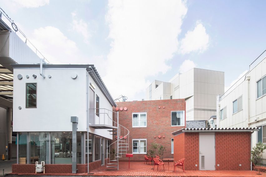
The ground floor has a brick base topped with large windows, while the upper level of the two-storey building has been wrapped in a facade made from galvalume steel, wood-wool cement and white mortar. A metal staircase connects the two floors.
While the previous store on the plot had taken up the entire site, the sweet shop was designed as a much smaller space.
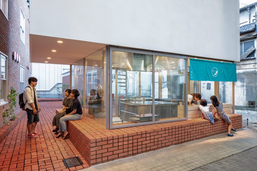
"Because a Japanese confectionary store does not need an eating area for customers, the required floor area of the store was very small in proportion to the site area, which means we have a large excess volume on the site," Schemata Architects explained.
It chose to design two buildings for the plot. The main store has a kitchen and a counter from which it sells traditional Japanese sweets such as dorayaki with a staff room above.
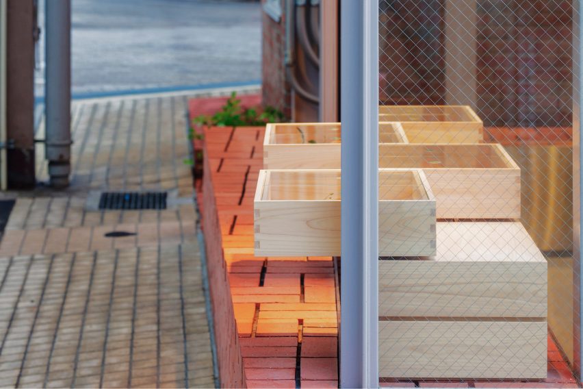
An extension of the main store's brick base functions as both a seating area for customers and a counter for the store workers.
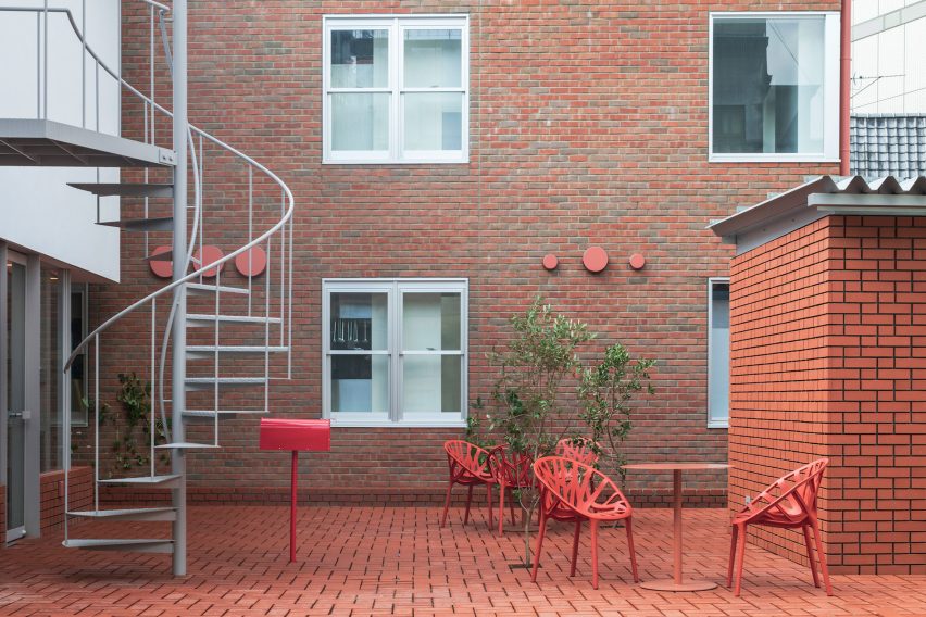
A second, smaller building is used as a storage room and sits across from the shop in the matching red-brick courtyard that also has cafe tables and chairs for customers to use.
"The open space are used as common space," Nagasaka said. "People sit there and ate the sweets but also sit and rest or gather with neighbours."
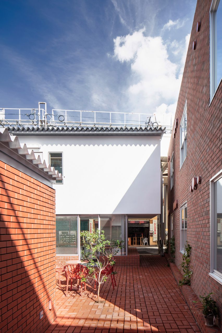
The studio added three small trees to the site, planted in voids between the bricks on the ground that can eventually be expanded by removing the bricks around the trees' roots as they grow.
"Considering such unique details, we did not fill in brick joints with mortar but left them as deep grooves to emphasize the solidity of bricks and highlight the contrast between light and shadow," the studio said.
This joint detail was also used on vertically-stacked bricks to create "a distinct brick appearance."
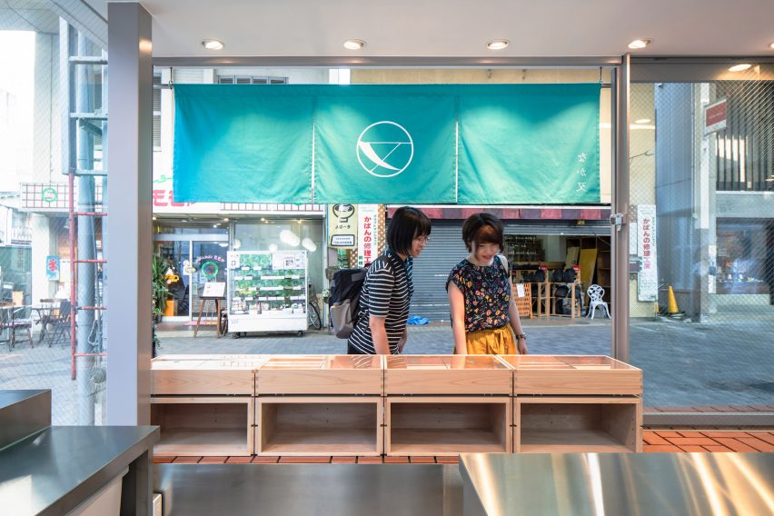
By creating space around the Nakamata store and its neighbours, Schemata Architects aimed to adapt its design to suit streets that have more vacant spaces than before.
"I thought that the newly created flow line through the empty space in the town would create something different from the past, such as richness and grandeur as an experience," Nagasaka said.
The store has had the desired result, according to the architect.
"The whole project boosts up the street or town itself," Nagasaka said. "More shops have been opened since then and more people are attracted by the designed stores, hotels, and museum."
Previous projects by Schemata Architects include a traditional bathhouse that has been updated with tiles and Towada stone and the red-brick interior for a Blue Bottle Coffee cafe.
Photography is by Shinya Kigure.
Project credits:
Architect: Jo Nagasaka/Schemata Architects
Project team: Takuya Sakamoto
Structural engineer: Tectonica Inc.
Construction: Miyashita Kogyo
